What happens behind that smooth and functional User Interface?
We’ve created something new, and you might have to use it.
And even though you didn’t explicitly ask us to upgrade our system, we still picked up on concerns, feedback and conversations we received. From you, your neighbour or maybe even a family member of yours. We want to ensure that using the Smartmile hubs will be as easy as possible.
Even though the biggest visible change is our machines’ design and looks, much more has changed. So let’s look at the ‘behind the scenes or actually ‘behind the screens’ since that’s even more accurate.
Let’s start with why we felt it was important to change our current User interface. In the years that we’ve existed, we have been improving the front and back end to ensure our systems run conveniently on a day-to-day basis. Last year we made big changes to our back end, and this year, we focused on finalising the front end. You can use the hubs to collect, send or even return your parcels, and couriers use the hubs to deliver or pick up parcels. And we hope to create a pleasant experience for you while using our machines.
Step 1: “Stop, look & listen” – Donna Summer
The User Interface worked and looked okay, but we don’t want to be told ‘you’re looking okay.
Who doesn’t want to be called stunning and good-looking? That is why we wanted our new User Interface to sweep you off your feet and make you fall in love with us a bit more.
Secondly, we wanted to listen to you. No matter if that ‘you’ is a consumer, supplier, courier or even a potential future partner or investor.
So after launching our previous User Interface, we started to listen to all the given concerns and write down any feedback we received to develop our front-end 2.0.
To do so, we had to work as a team. Sounds logical, but have you ever thought about the complete process of optimising a consumer experience? We didn’t just change a few colours and buttons.
We asked our customer service, the heroes you might have spoken to on the phone or in an email, to give us a clear insight into all the feedback and concerns they have collected over the years.
This combined gave us a good start, so we could focus on specific aspects and pain points to improve.
“We’ve received some calls over time concerning the customer journey. Some customers found it unclear what to do when they picked a compartment that was too small and got confused by the interface.”
– Laila, our Customer Service queen.
So in the flow design, we focused on making the interface self-explanatory, keeping instructions minimal and instinctive yet effective. We compared all flows against repeated customer feedback. So step one, optimising flows and simple directions done.
Step 2: Getting that interface looking and feeling all fly
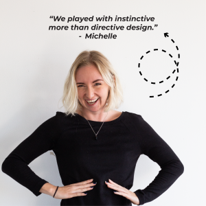
This is where our marketing and brand team came in. To make sure that we could improve our current user experience, they designed a new and improved interface that would clear up any potential confusion and put the focus on the task at hand from the user. So they developed a design to make every process as clear as possible.
“I wanted to keep the design simple, cutting down any visual clutter. When it comes to flow and experience, we played with instinctive more than directive design. We tested different versions many times in different cultural contexts, supported by the information we received from the users themselves.”
– Michelle, Head of global Marketing and Brand.
Apart from even better looks, which we improved on our machines, there is a lot of functionality behind it. To ensure that any consumer or courier has the most efficient User Interface, we designed a clear button that sets the interface apart for couriers and consumers. If you’re a courier, you click on the button for couriers, and you’re on your way to fill in your credentials and start loading the parcels in the machine.
Are you a consumer? Just click on the action you want, and the machine will do the rest. Pick up your parcel? Just click the button. Return your package? Click Return. Are you sending a parcel to a new owner? No problem, just click send.
Any screen that follows will show you clearly what to do and how to do it.
We need our amazing tech team to make this beautiful design usable on our machines. Because looks aren’t the only thing that matter.
After finishing the design and incorporating all the collected information, the tech team started to develop design mock-ups to practice.
Before I reveal any of our tech secrets, keep in mind that the following paragraphs will contain a lot of technical information. If that is not your cup of tea, feel free to skip to the section with the subtitle ‘Step 4: Showing off a little’ to continue reading about our newest development.
Step 3: Nerdy talk…
For those still with me, welcome to some nerdy talk!
Because optimizing and developing a system that has the flexibility to integrate any hardware or future partner into its ecosystem, isn’t built in a day.
The tech team has been working on a system that removes most of the machines’ weight. By stripping internal functionalities and abstracting API functions, they took some pressure off the system processes, speeding up the useability of the machines. This way, we can load the next screen faster and easier, offering the user a better experience.
Next, we changed the skeleton of all our software to improve our possibilities in the future to optimize the Smartmile machines. With this new skeleton, it will be even easier than it already was to add new initiatives, partners, other hardware manufacturers or even new courier companies to our ecosystem. Not only is this faster for the user, but it’s also a lot smarter behind the screens, abstracting API functions and simplifying the process of adding these new features for our tech team.
Allowing innovations, green initiatives and even new future tools to be even easier implemented into our systems whenever we need to.
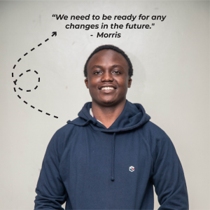
“Tech will always keep changing; that is also why we need to be ready for any changes in the future.”
– Morris, Project manager on the new UI, team tech.
As Morris already said, we are making sure that we are ready for any future innovation in tech. Connecting drones to our parcel hubs? Click, click, POW! We can integrate it. Do you want us to offer click-and-collect for online and offline stores? We will have the supporting tech ready in no time.
Besides that, Morris emphasised that the updates are necessary for overall security. If the software and hardware aren’t up to date, it could become a cybersecurity issue.
Our machines are secure because of active support and ensuring all the software is up to date.
With the new software, we can show the operator any problem with the machine, no matter where our operator might be on the planet. No matter the location, our team can and will ensure that all operations go as smoothly as manageable/ possible.
Step 4: Showing off a little
What are some other improvements we implemented into the new user interface?
One of those is a new favourite from Maarten:
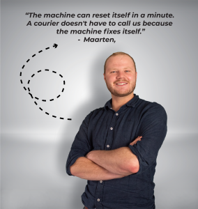
“When our machine freezes in the middle of a loading screen, it will reset itself in a minute. This way, the courier doesn’t have to call us to fix it cause the machine fixes itself.”
– Maarten, Operations manager NL.
Maarten is one of our operations geniuses, so this software will make his job easier. Instead of getting a call from a courier that is losing valuable delivery time, the machine will restart itself, ensuring that the courier can quickly continue his job.
In that valuable time, our customer service unicorns and operational heroes can focus their efforts on other affairs, like helping others out.
A few of our unicorns presented our new UI to potential partners, giving them a sneak peek into their possible future partner interface. What they came back with; was many feathers and excitement.
“They loved our new design, which is easy to follow. Apart from that, they found it very advanced and believed it would be a valued addition to the customer experience.”
– Seda, Head of Sales.
As we’re getting closer to entering a new market, it gives us a lot of confidence to hear such positive feedback from, hopefully soon to be, a new partner.
Altogether, this project was only possible with the hard work of many different departments. We’ve created something beautiful by working together and including all the various departments. Just like we hope to work together even more with other companies, partners and investors to build a brighter future with strong delivery ecosystems.

